 +91
9499399914
+91
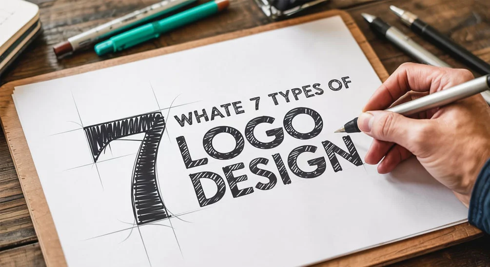
9499399914What are the 7 types of logo design?
April 26, 2025
A brand uses Logos to assume its identity in the market. Corporate identities begin with logos since these visual elements provide the initial story about business values to clients’ perception. The world contains numerous distinct logo styles. Every logo design category exists with its individual goal to deliver a different meaning. The following blog will examine seven logo design categories by explaining their special attributes along with practical usage guidance. We will now start our creative adventure through this journey that you can enjoy with coffee in hand and comfortable relaxation. This guide will explore what are the 7 types of logo design, each with its unique attributes and applications.
Wordmarks (Logotypes)

The fundamental principle behind wordmarks is to maintain simple and legible design elements. The company selects its official name as its logo and makes the letters distinctive through typographic methods. Think Google, Coca-Cola, or FedEx. The logos stay straightforward as they powerfully depend on their font style combined with color selection and spacing elements. A logo design company in India can help craft a unique wordmark that captures the essence of your brand through typography.
Why Choose a Wordmark?
A wordmark logo will boost brand recognition when you use a special or memorable brand name.
Wordmarks remain simple enough for people to remember them instantly.
Wordmarks demonstrate great adaptability since they function well on multiple forms of media.
Design Tips:
- The selected font should match the personal qualities of your brand. The chosen wordmark expresses either playfulness alongside seriousness alongside modernity alongside traditionalism.
- Mass and alignment should be properly managed to maintain clear readability.
- Creating custom typography is an excellent way to develop an original wordmark.
Lettermarks (Monogram Logos)

A lettermark symbol is like a wordmark yet replaces whole names with their initial letters. Think of IBM, HBO, or NASA. Companies with extensive names can use these logos to present a stylish professional design.
Why Choose a Lettermark?
Abreviated names through lettermark techniques become easy to remember.
Estate brands typically choose lettermarks which build trust through their professional appearance.
Their ability to adapt to multiple shapes and multiple format sizes allows them to be flexible.
Design Tips:
- Initials need to be written so they remain easy to read.
- Your brand image should match the typography selection.
- The creative element of placing negative space around your logo helps modernize its presentation.
Pictorial Marks (Logo Symbols)
![]()
A graphical logo takes the shape of a symbol to represent the brand among viewers. The same iconic logos which Apple has with an apple and Twitter has with a bird belong to this category. These logos achieve instant brand recognition through their easy recognition power. Understanding what are the 7 types of logo design can help you decide if a pictorial mark is the right choice for your brand.
Why Choose a Pictorial Mark?
Symbols that have been designed smartly become instantly recognizable to viewers.
The same logos adapt well to numerous language settings and cultural frameworks.
Unique symbols create memories in people because they become memorable.
Design Tips:
- Your brand should select an image which represents the most important aspects of your brand identity including products or central values.
- Minimal design elements should be used to create a recognizable symbol.
- Scientists should review the graphic appearance to determine its usefulness across various dimensions and background conditions.
Abstract Marks

Pictorial logos under the category of abstract marks avoid showing direct representations of objects. When considering what are the 7 types of logo design, abstract marks offer a creative way to represent your brand uniquely. Abstract shapes function in these marks to deliver the fundamental message of a brand. You should consider the Nike swoosh along with the Pepsi circle as examples.
Why Choose an Abstract Mark?
Abstract symbols serve to present your brand using original methods for unique representation.
Abstract designs serve multiple interpretations which grants creative design freedom to users.
These marks adapt to all sorts of shapes and dimensions.
Design Tips:
- The selection of specific shapes and colors should generate the appropriate brand feelings.
- Design the logo in an easy manner which enables people to remember it.
- Verify the logo’s effectiveness through multiple setting checks.
Mascots

The mascot logo shows a brand representation through illustrated characters. The KFC Colonel and the Michelin Man represent two effective mascot logos. Safety-Kleen Systems leverages colorful mascots which construct an engaging approachable company image to their brand.
Why Choose a Mascot?
A mascot brings a personal quality to your company brand.
Your audience develops better engagement because mascots serve as effective relationship-builders.
A mascot logo enables numerous applications throughout marketing content alongside promotional activities.
Design Tips:
- Create a symbolized character which represents all elements of your brand identity and corporate values.
- Organize the mascot design to accommodate numerous applications.
- Building a clear portrayal of mascot and audience interaction must be included in your plan.
Combination Marks

Combination marks connect words with symbols to form an integrated logo. The brand logos of Burger King and Lacoste present an example of combination marks because they use text elements with visual symbols. Combination marks provide an excellent solution because they incorporate understandable textual information and eye-catching dynamic imagery. Collaborating with a logo design company in Delhi can ensure that your combination mark effectively integrates text and imagery for maximum impact.
Why Choose a Combination Mark?
- Their functionality allows use either together or independently for adaptable purposes.
- A brand name shines through the text yet it finds its visual strength thanks to the included symbol.
- Wells-designed combination marks develop exceptional brand recallability due to their exceptional design.
Design Tips:
- The graphical element must match well with the textual message of the mark.
- The design needs to keep both its elements balanced and harmonious.
- The logo needs testing through different presentation formats to guarantee its successful performance in all applicable situations.
Emblems

A logo type known as emblem contains written text inside a symbolic design. Think of Starbucks or Harley-Davidson. These logos create traditional feelings that schools as well as organizations and government agencies frequently implement.
Why Choose an Emblem?
Authority through these designs creates traditional and authoritative expressions.
The enclosed design element gives this creation its unique appearance.
These symbols succeed when used on badges and seals as well as other official materials.
Design Tips:
Place the text so it remains readable for when viewers look at the emblem.
Build your design with unique elements only when it serves to prevent visual confusion.
Plan the emblem’s appearance in both small and large formats and formal uses.
Conclusion
A business must carefully select its logo type because it determines the foundation of brand recognition. Every company logo should communicate brand values to audience members by selecting either word-based layouts or complex visual designs. The mark of an excellent logo stems from both visual appeal and lasting first-time impressions made on viewers. By exploring what are the 7 types of logo design, businesses can select the style that best communicates their brand values and resonates with their audience. Your logo development should take time since trying various approaches along with creativity will help you find the right path. Your logo stands as the primary visual representation of your brand thus needing proper attention to shine.
