 +91
9499399914
+91
9499399914Time for a Logo Makeover? Let’s Talk About It!
January 13, 2025
Hey there, fellow creatives! Are you one of those who view your logo and think to yourself – is this who we are? From time to time, and given the currently rapid developments in branding, our beloved logos may require some care to remain loyal to our brands. Well, sit back, relax and let’s get started (I am on my second cup of coffee) and get started with the topic of logo design. We’ll look at why logos are important and when you may need a new one and how to make the right choice for your business.
Logos Matter More Than You Think
The Face of Your Brand
Your logo should be considered your company’s face. It is something one is likely to encounter as soon as one comes across your business. Many customers associate brands with logos in the same way we human associate our friends with their faces. In essence, a well thought logo creates a positive first impression and this goes along way into dictating the perception that followers have on everything else to do with the brand.
The Emotional Connection
While a good logo design looks good, a brilliant logo is one that elicits an emotion. It could create happiness, confidence, anticipation or most importantly memory recall of past events. That tiny swoosh that we see on a pair of Nike shoes at first glance? They don’t merely put a catchy symbol on their products; it represents encouragement and success. It is that which makes the logos such a force; an appeal to emotions.
Standing Out in the Crowd
Many experienced marketers know that differentiation is the key on the modern full of offers and competitors market. If you want to stand out from your colleagues, a creative logo is always helpful for people to remember. It’s much like wearing a nice suit to a party – people will look at you and notice you! Now consider the ability of the McDonalds golden arch to be understood anywhere in the world regardless of the country you are in.
Building Brand Loyalty
In the process of branding it becomes associated with your company’s reputation in the long run. Brand identity is that consistent and recognizable logo design ensures that customers are loyal. Returning customers are more frequent where they understand and have confidence in the brands they are using. Just imagine yourself when you were deciding between two similar products: what did you always choose—an unfamiliar brand with its unknown logo?
There are several Logo Design Company in India. Take your time to choose one that has a strong understanding of what branding entails and the audience that the logo is meant to communicate with.
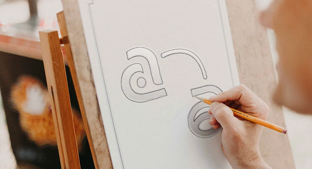
10 Things You Should Not Do When Designing Your Logo
![]()
So how much do you know about your logo and can you tell when it requires a bit of attention? Here are some telltale signs:
1. It’s Outdated
This is because design trends evolve with time. The choiced of styles that was popular some ten years ago seems rather unusual today (what has become of all those drop shadows and gradients?). If your logo is out of date in the way that could make it shuffle off to logover, it may be best to update.
Real-life Example: Take a look at Burger King that redesigned their logo recently. Pantone had shifted from their glossy, 3D mode of logo designing back to a flat design that resembled the earlier but contemporary forms of logo designing.
2. Your Business Has Evolved
Companies evolve—perhaps, you offered additional products or improved your values proposition, or entered a new niche. Of course, your logo should address these changes.
Question for You: It is your common dilemma wherein your company has evolved or expanded in a direction whereby the current emblem seems less suitable?
3. It’s Too Complex
Some branding gurus have pointed out that it is rather easy to commit a logo error than achieve perfection in logo design because, in the world of logos, less is always more. When your logo has too many items on them, they could be difficult to remember when the time comes.
Fun Fact: Interestingly when Nike began as a company, their logo consisted of a swoosh in addition to the word Nike. In the end they stopped using the words beneath it because the silhouette of the swoosh became symbolic on its own.
4. This goes back to the reason why it doesn’t resonate with your audience, because you don’t truly know who your audience is.
It may be the fact that your logo is not very appealing to your target market, anymore. Perhaps your target audience is different, or they are different people with different demands now.
Interactive Thought: Ponder on the fact that you are targeting your perfect customer. What appeals to them? Is the logo you perceive fitting their expectations and preferences?
5. It’s Not Versatile
Logo should be as comfortable any itself in Internet site and Fb as on cards, T-shirts and even on the huge spectacular board in Times Square! If you are unable to scale it or it simply doesn’t translate well or work in other formats, then you need to move on.
6. Negative Feedback
Has anyone ever comment or criticize your logo? It is impossible to make all people satisfied, but constant remarks may signal the need for a change.
Pro Tip: Constructive criticism is one of the biggest assets any designer can ask for. Embrace it!
Telling the Story of the Evolution of Famous Logos
However, there is so much more to redesigning a logo that it would be beneficial for me to get started on my own now that I have given you examples of some famous brands that got redesigning their logos.
Apple

Apple’s first logo was of Isaac Newton sitting under an Apple tree. Though it contained dates and historical chronology of events, it was very much given in detail. They reduced it to the bitten apple symbol which we see nowadays. What I found fascinating here is how this minimalistic design crowned Apple as the trendsetter in minimalistic simplicity and avant-garde.
Airbnb

Airbnb then included a logo they named the Bélo, which which represents people, places, love, and Airbnb. Change of the logo was daring and it embraced the fact that they are a global community company.
Mastercard

Mastercard and the text are no longer part of their logo; instead, it features two curved circles – one red and one yellow. This could be done while in harmony with the growing tradition of brands using easily recognizable basic shapes.
Reflective Question: From these brands, you can learn the following about logo and its relationship with the firm’s personality and values.
How to Redesign Your Logo Correctly
Then let it be the start of the redesign journey? Here is the detailed information to help you through the process –
1. Self-Reflection: Understand Your Brand
To ensure you come up with the best name, avoid writing it down before deep research on your brand.
Mission and Values: What do you do and why do you exist? What values drive you?
Target Audience: Who are your customers? What do they care about?
Brand Personality: Are you playful, wild and energetic and vice versa, are you formal, rigid, and stern?
Interactive Exercise: I already came up with five adjectives that describe my brand, those are; Launching, Professional, Refreshing, Sophisticated, and Successful. This will inform the style of the design of your product.
2. Seek Information and Find Ideas
Go online, to newspapers, and even into nature for inspiration.
Competitor Analysis: What do other players in your industry look like? How can you stand out?
Visual Inspiration: Generate a board with appropriate colours and typography that you wish to adopt for your brand.
Pro Tip: Pinterest is probably the best tool to gather a plethora of visual concepts!
3. Brainstorm and Sketch Ideas
But now, anything goes.
Sketch Freely: Don’t worry about perfection. Scribble, sketch and write down on paper whatever comes into the mind.
Think Symbolically: Which images or symbols do you associate with your brand?
Fun Activity: You need to invite your whole team and organize a meeting where you will discuss the problem. Sometimes the best ideas are achieved out of brainstorming and coming up with teamwork!
4. Refine Your Concepts
Choose the best few sketches that to continue with.
Get Feedback: Tell your inspirations to at least one or two close friends or colleagues.
Consider Feedback: Scrape for patterns in the feedback that you’ve received. Are there factors people enjoy or things they dislike?
5. Digitize Your Design
So it’s time to give this sketch life!
Choose the Right Tools: This program can be considered to be the best among all those used for vector graphics by designers.
Play with Typography: It is also important to modify the typeface of the text in your logo if any, to a font relevant to the identity of your brand.
Interactive Tip: Check how the logo looks like in black and white at first to avoid problems with color.
6. Experiment with Color
Colors are therapeutic and they have a psychological effect.
Color Psychology: Go and study the color meanings on a distinct form.
Stay Consistent: Your logo must have proper colors according to the overall color scheme that you have used in other parts of your company.
7. Ensure Versatility
Your logo has to be flexible.
Scalability: It should look good on a small ‘app icon,’ as well as on a large billboard.
Multiple Formats: Consider how it looks like when it is printed in horizontal, sound and square forms.
8. Gather More Feedback
At this stage, the idea is to get more varied opinions.
Surveys and Focus Groups: Perhaps it will also be advisable to solicit response from your target consumers.
Be Open-Minded: Bear in mind that one cannot always take into account every client’s idea, but feedback is crucial.
9. Firm up and Seal Your Emblem
You’re almost there!
Refine Details: Tweak any final elements.
File Formats: Store your logo in all formats that are PNG, JPEG, SVG, EPS, etc so that it can be used in different places.
Trademark It: It is important to seek legal protection of your new logo.
10. Launch with Flair
It’s time to reveal the artwork that you’ve produced.
Marketing Materials: You need to communicate the necessary changes on your website, social media accounts, your packages, etc.
Tell Your Story: Include your audience in the process of redesigning that you are going through. It’s no secret that everyone loves to learn about the behind the scenes actions!
Celebratory Idea: Organize a virtual launch ‘event’ or make a video talking about the new logo.
For those based in the capital, collaborating with a skilled logo design company in Delhi can provide you with insights and expertise tailored to your local market.
Tips for a Standout Logo
![]()
New Hires for the quality that paid everyone in town wanted your logo to be. Keep these tips in mind:
Keep It Simple
Simplicity makes your logo to be easily identifiable and memorable among your target market. Imagined brands such as McDonalds and Nike; either of their logos symbolizes a company.
Be Unique
That is why it is highly essential not to have your logo look mundane, you have to avoid using popular signs and obvious referring to a proverb, for instance.
Make It Timeless
But it’s okay to tip your hat to what’s current, strive to create a logo that will be relevant in the future, whatever that may be.
Pay attention to the Cultural Differences
If you are in the global market, be careful if the logo you design has any distasteful meanings to another culture.
Test in Different Contexts
You need to present your logo on different backgrounds and combined with other objects to check its performance.
Features Which Should be Avoided When Designing a Logo
It can happen to anyone, even experienced designers get it wrong sometimes. Here are some pitfalls to steer clear of:
Overcomplicating the Design
Including many variables is counterproductive since it is easy for the audience to get lost and fail to implement all elements properly. Stick to the essentials.
Ignoring Scalability
A nice looking logo might look good when enlarged, but it does not look as good when made small. It thus should uphold its concepts at all sizes.
Choosing the Wrong Fonts
Oh, yes you knew the problem, typography can simply make and break your logo. Make sure your font is clear in text so this is simple and the font should correspond to the overall image of the brand or product.
Relying Solely on Trends
Trends fade. It is not bad to be modern but referencing your design mostly on the contemporary world will make your logo look out dated.
Not Getting a Second Opinion
Your fresh eyes in some way see what you yourself could not see right before you handed it off to someone else. Always get feedback!
By reading and analysing the chosen articles, six logo redesign stories are presented at this stage.
Here is the list of inspiring and creative stories to get your creative gears going.
Old Spice

Old Spice, which was once outmoded, decided to change its image and slogan in order to attract young men. The tactics such as unorthodox and playful are funny and combined with a new logo were a creative revamp of the brand.
The first logo of Instagram was a complex sketch of a camera. With the growth of the application, they sketched the logo and reduced it to that colored gradient icon we use daily. This was a minimalist approach which is in line with the modern and global user base of these companies.
Thought to Ponder: By simplifying your logo, how can it show people that it is for them?
Reflecting On The Emotional Way
When redesigning your logo, it’s not just a task for a designer; it’s an experience.
Nostalgia vs. Progress
I understand why you still have your old logo; it is like leaving your first love behind. Remember, it has been a part of your journey, for however long a time it was that you have been together with your partner. However change, is something that, when accepted can create opportunities.
Team Dynamics
Make your team members participate in the process. And with that, it not only encourages cooperation with other people’s ideas but also makes everyone concerned feel that they are taking part in a new idea.
Personal Anecdote: When I was using a startup to redesign their logo, the first challenge we came across was; The teams fond memories of the previous logo. Having included them in the concept creation process, they would turn into brand advocates who wait for its progress.
The Effects of Color and Typography
Let’s drill down a little bit more on how color and type affect your logo performance.
Color Psychology
You have perhaps noticed that different colors can trigger some emotions or some associations.
Red: Leader, motivating, committed and driven, timely (refer to the example of Coca Cola Company).
Blue: Trust, business like, no drama, (like Facebook)
Green: Success, well being, harmony (though the corporation Starbucks is quite famous).
Yellow: Joy, hope, and guardiness as McDonald’s happy sign.
Interactive Exercise: Consider what feelings your brand should make people have. Choose colors which resemble feelings associated with these emotions.
Typography Matters
That is why the font you decide to go with speaks a lot.
Serif Fonts (e.g., Times New Roman): Traditional, reliable, formal
Sans-Serif Fonts (e.g., Helvetica): Modern, clean, approachable
Script Fonts: Elegant, creative, feminine
Display Fonts: Singular, arresting,bold
Pro Tip: Make sure, when choosing the font, it remains clear for any size and type of media that it will be used for.
The Technical Side: Formats and Guidelines
To keep your logo looking sharp everywhere, consider these technical aspects:
Vector vs. Raster
Vector Files (e.g., SVG, EPS): These can be produced to an infinite extent without any provision of quality being compromised. Ideal for logos.
Raster Files (e.g., JPEG, PNG): While in its original form which is pixelated, it gets blurred when resized.
Color Modes
CMYK: Used for print materials.
RGB: Used for digital displays.
Reminder: Alway s Make sure to save the original files in vector format. They will become your reference point for any future fix to the chemical plant’s problems.
Launching Your New Logo: Making a Splash
You have done all the hard work now its time to flaunt it!
Create a Teaser Campaign
Subtly warm up your audience by posting small images that are partly blurred or the fragments of your new logo on your social pages.
Share the Story
People love a good story. Let people know the process of redesigning – the ideas, problems, and accomplishments.
Update All Platforms
Consistency is key. Refresh your logo in one pass – through web, social media, email signature, and more.
Engage Your Audience
Ask your followers what they think of the design or come up with some kind of contest in which your new logo will be involved.
Fun Idea: Selling Next’s new logo t-shirts or sweatshirts to end consumers can be achieved by setting up a limited edition merchandise.
Dealing with feedback post-launch
It will not please everyone, and that is perfectly suitable, no one has to be happy about it, but it is progress.
Listen and Assess
Constructive Criticism: Look for any feedback that would be useful in enhancing could be enhanced.
Resist Knee-Jerk Reactions: Give it time. It takes some time for people to accept change.
Stay Positive
Pay attention to the cheers and enjoy the accomplishment of successfully creating a new product launch.
Great Logo Design and the Power It Carries
All in all, a logo is not just a symbol but a part of your brands equity and utmost importance.
Builds Trust: The clients automatically associate a professional looking logo with quality and ability to deliver as expected.
Creates Recognition: In the long run, customers are in a position to relate your logo to all those positive experiences.
Supports Marketing Efforts: This implies that every logo strengthens the advertising and promotional activities of the product.
Encouraging Note: Bear in mind that, all big brands had their beginning at one point. Your new logo is a step to the bright future of you business.
Final Thoughts
Logo redesigning is a great chance to give a new look to your brand identity. Consequently, brand identity management guides your logo development process to create one that perfectly reflects who you are and where you are going.
Let me repeat that: a logo is not just a picture, it is an image which makes people see and decide in a certain way. Therefore, spend your time, enjoy the process and develop something that will make you proud to exhibit to the world.
Our goal for this guide was to encourage you to start a fresh logo design process and strive for greatness. In case you have any questions or need additional tips, please do not hesitate to write. Available to guide you through every intersection.
