 +91
9499399914
+91
9499399914Top 10 Digital Art from Metal Bands
April 1, 2024
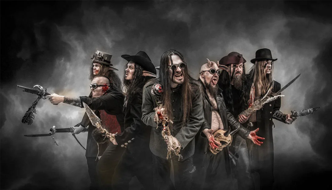
Heavy metal is a whole culture and community centred around the music, not just a set of loud drums and screaming guitars. The emblematic logos and symbols that bands use to identify themselves are at the core of this universe. These graphic calling cards are closely associated with the personas of their favourite metal bands for fans. Metal bands, in contrast to mainstream performers, invest a great deal of time and energy into their visual branding. The genre, themes, and attitudes of the music are reflected in their logos. Metal insignia, such as the ram horns of Dio or the spooky bat of Ozzy Osbourne, are artistic extensions of the bands they represent.
1. Cannibal Corpse

The emblem of Cannibal Corpse, a band renowned for their harsh and intense sound, opens our list. Their logo design, which combines graphic designs reminiscent of violence and gore with distorted typography, effectively captures the visceral quality of their music. Artist Vince Locke designed the logo, which has come to represent the band’s identity.
2. Black Sabbath

Black Sabbath was one of the first bands to establish the sound of heavy metal, and their emblem was a perfect fit for the sound of the band. Contrasting sharply with the flowery hippie fonts of the day, the elongated, almost cryptic script conjured a dark atmosphere. Like the thunderous chords and gloomy lyrics of songs like “Iron Man” and “Paranoid,” the typeface was bold and aggressive, demanding attention. The emblem captivated the attention of headbangers across the globe.
3. Slayer

When Slayer‘s emblem was first created in the early 1980s, it instantly distinguished the band from other metal bands of the day. The Slayer logo had a menacing, insane appearance, in contrast to the clean, stylized appearance of many other metal logos. The emblem known as the inverted pentagram, which is frequently connected to the occult, alluded to the sinister and contentious subjects that Slayer was not hesitant to delve into in their music. The logo’s chaotic, fractured forms allude to the rapid tempo shifts and high-speed acceleration that define Slayer’s technically challenging playing.
4. Megadeth

The Megadeth logo combines punk rock vibes with robotic, futuristic typefaces. The band’s avant-garde compositions and refusal to conform to genre norms are alluded to by this creative graphic design. Similar to how Megadeth pioneered technical thrash music, their logo defied convention by fusing digital precision with visceral emotion. The image does a fantastic job of capturing why Megadeth is still one of the most innovative and significant bands in metal history.
5. Death

The iconic logo of Chuck Schuldiner’s Death, a pioneer in the death metal genre, is a consultant of the band’s progressive sound. Sharp edges and a competitive design evoke the progressive and technological elements in the music within the brand. Even though it is diffused, it has a strong presence and is a timeless illustration of Death’s ongoing effect on the style. The band’s revolutionary and raw energy-infused brand is a testimony to their groundbreaking reputation, solidifying their position in metal records with a resonance and depth that never wavers.
6. Obituary

The band’s unwavering concentration on death and decay is reflected in Obituary’s emblem, which features text that has crumbled and disintegrated. The rough look of the logo wonderfully captures the unadulterated intensity that has distinguished Obituary’s sound over decades, as well as the rawness of the band’s music. It serves as a representation of the band’s tenacity, changing over time without losing sight of their unwavering commitment to death metal. The obituary’s logo is a haunting symbol of their eternal legacy, etched with unparalleled potency into the annals of extreme music history, akin to a relic from the depths of the abyss.
7. Iron Maiden

British heavy metal icons Iron Maiden have been creating distinctive visuals to go along with their innovative sound since they formed in 1975. Eddie the Head, the eerie mascot who has appeared on practically all of their album covers and even takes the stage during their extravagant live concerts, is at the core of this. Eddie’s decaying visage and threatening grin perfectly capture the morbid themes found in many of Iron Maiden’s songs.
8. Metallica

One of the most known images in rock music is the famous logo of Metallica. The band’s name is spelled out in capital letters in a bold, metallic style that exudes attitude and strength. However, the simplicity of their insignia is what makes it so distinctive. Metallica chose clean, simple text over the elaborate images or abstract visuals that were common in many band logos of the time. Their thrash metal style was direct and fit their basic look. Metallica reduced the pomp and showy guitars of 1980s metal to a foundation of simple, powerful riffs. Similarly, their emblem favoured sheer force over intricate graphics.
9. White Pony – Deftones

Many excellent metal covers are intricate and complex. There is a lot of violence and demonic imagery, which is cool. I adore it. It’s true that sometimes a lot less really is a lot more, though. Perhaps the greatest Deftones record to date is this one. Similar to the song, the cover also knows how to use softer, quieter aspects to create something striking and memorable. Essentially, the difference isn’t that great. A white horse stands out despite being the only one on a grey background.
10. Decide

The band’s blasphemous and anti-non secular mindset is embodied in Deicide‘s logo, which capabilities tough, jagged text. Its forceful method functions as an effective image of rising, reflecting the intensity and controversy of Deicide’s lyrics. The emblem’s ominous look is a super match for the band’s unwavering mindset of wondering about social conventions and stirring feelings with its notion-upsetting subjects. Deicide’s brand shatters conventions like a razor-sharp proclamation of defiance, developing a lasting impact on the extreme steel scene. It represents the band’s unwavering determination to break down barriers and taking up taboo topics head-on with relentless ferocity.
FAQs: Your Questions Answered
1. What distinguishes unique heavy metal band illustrations?
The dark, ornate graphics used in heavy steel band images frequently allude to the themes of insurrection, gloom, and fantasy inherent in the genre. Frequently, they use elements such as skulls, demons, and occult symbols to evoke a sense of mystery and profundity.
2. Which talented illustrators are known for their work on heavy metal bands’ illustrations?
Famous for their iconic illustrations within the heavy steel movement are artists such as Andreas Marschall (Sodom), Ed Repka (Megadeth), and Derek Riggs (Iron Maiden). Their work has come to be associated with the bands they have worked with, influencing the style’s visual character.
3. What role do the graphics of heavy steel bands play in their branding?
When it comes to establishing a band’s visual identity and branding, illustrations are crucial. They help to portray the band’s sound, themes, and attitude through their music, creating a lasting impression that appeals to fans and sets them apart from other artists in the genre.
4. What peculiar themes can be seen in the artwork of heavy metal bands?
Typical motifs include images drawn from mythology, horror, and the occult that include pentagrams, devils, and otherworldly beings. These elements contribute to the dark, rebellious look of the genre, creating eye-catching artwork that effectively conveys the spirit of heavy metal songs.
5. What effects have technological developments had on the artwork of heavy metal bands?
The creative possibilities for heavy metal band illustrations have increased with the development of digital art tools. More ease with which to include dynamic effects and rich details has allowed artists to create visually spectacular artwork that honors the traditions of the genre while pushing the boundaries of imagination.
